Chart of Covid Deaths in R Graphics
For parts 1 and 2 of this assignment, I have shown comparisons of the regression models from the anscombe01.R document by showing different ways to create the plots by changing the colors, line types, and plot characters:
- Here I changed the color of the outline of the plot characters from red to purple, the background color inside the plot characters from orange to pink, and the regression line from blue to green. I also changed the plot characters from the plot character identification number of 21 to 11. Finally, I changed the regression line from a solid line to a dotted-dashed line.
## Anscombe (1973) Quartlet

data(anscombe)  # Load Anscombe's data
View(anscombe) # View the data
summary(anscombe)

## Simple version
plot(anscombe$x1,anscombe$y1)
summary(anscombe)

# Create four model objects
lm1 <- lm(y1 ~ x1, data=anscombe)
summary(lm1)
lm2 <- lm(y2 ~ x2, data=anscombe)
summary(lm2)
lm3 <- lm(y3 ~ x3, data=anscombe)
summary(lm3)
lm4 <- lm(y4 ~ x4, data=anscombe)
summary(lm4)
plot(anscombe$x1,anscombe$y1)
abline(coefficients(lm1))
plot(anscombe$x2,anscombe$y2)
abline(coefficients(lm2))
plot(anscombe$x3,anscombe$y3)
abline(coefficients(lm3))
plot(anscombe$x4,anscombe$y4)
abline(coefficients(lm4))


## Fancy version (per help file)

ff <- y ~ x
mods <- setNames(as.list(1:4), paste0("lm", 1:4))

# Plot using for loop
for(i in 1:4) {
  ff[2:3] <- lapply(paste0(c("y","x"), i), as.name)
  ## or   ff[[2]] <- as.name(paste0("y", i))
  ##      ff[[3]] <- as.name(paste0("x", i))
  mods[[i]] <- lmi <- lm(ff, data = anscombe)
  print(anova(lmi))
}

sapply(mods, coef)  # Note the use of this function
lapply(mods, function(fm) coef(summary(fm)))

# Preparing for the plots
op <- par(mfrow = c(2, 2), mar = 0.1+c(4,4,1,1), oma =  c(0, 0, 2, 0))

# Plot charts using for loop
# I changed the color of the outline of the plot character from red to purple
# I changed the background color of the plot character from orange to pink
# I changed the line representing the "line of best fit" from blue to green
for(i in 1:4) {
  ff[2:3] <- lapply(paste0(c("y","x"), i), as.name)
  plot(ff, data = anscombe, col = "purple", pch = 23, bg = "pink", cex = 1.2,
       xlim = c(3, 19), ylim = c(3, 13))
  abline(mods[[i]], col = "green", lty = 4)
}
mtext("Anscombe's 4 Regression data sets", outer = TRUE, cex = 1.5)
par(op)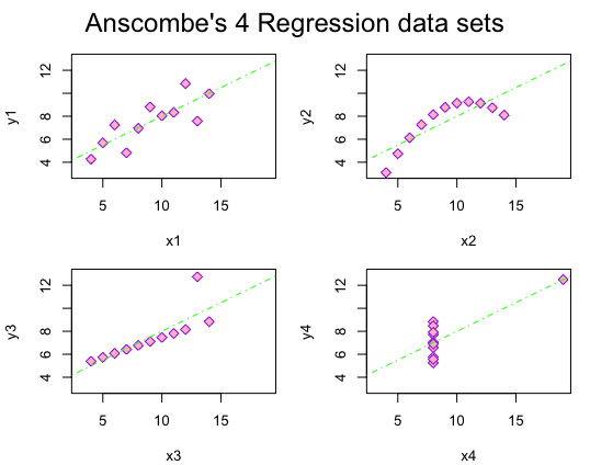
For part 3 of this assignment, I have shown comparisons of the regression models from the anscombe01.R document by showing different ways to create the plots with ggplot2:
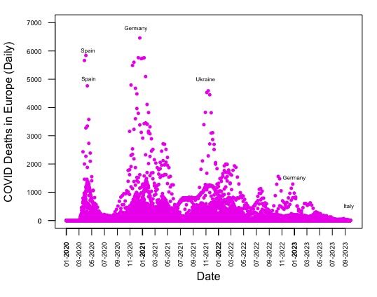
For part 4 of this assignment, I have shown how to replicate a Scatterplot matrix of daily COVID deaths in Europe by month from 2020 to 2023 without using ggplot2 or any packages:
## Download COVID data from OWID GitHub
owidall <- read.csv("https://github.com/owid/covid-19-data/blob/master/public/data/owid-covid-data.csv?raw=true")
# Deselect cases/rows with OWID
owidall <- owidall[!grepl("^OWID", owidall$iso_code), ]
# Subset by continent: Europe
owideu <- subset(owidall, continent=="Europe")

date <- as.Date(owideu$date, format = "%Y-%m-%d")
deaths <- owideu$new_deaths

plot(date, deaths, type = "p", ylim = c(0, 7000), xlab = "Date",
     ylab = "COVID Deaths in Europe (Daily)", col = "magenta2", pch = 16,
     cex = 0.7)
par(las = 2)
axis.Date(1, at = seq(min(date), max(date), by = "2 months"),
          format = "%m-%Y")
axis(2, at = seq(0, max(y), by = 1000))
par(mar = c(5, 4, 1, 1) + 0.1, cex.axis = 0.6)
text(x = as.Date("2020-04-15"), y = 6000, labels = "Spain", cex = 0.5)
text(x = as.Date("2020-04-18"), y = 5000, labels = "Spain", cex = 0.5)
text(x = as.Date("2020-12-01"), y = 6500, labels = "Germany", cex = 0.5,
     pos = 3)
text(x = as.Date("2021-11-01"), y = 5000, labels = "Ukraine", cex = 0.5)
text(x = as.Date("2023-01-01"), y = 1500, labels = "Germany", cex = 0.5)
text(x = as.Date("2023-09-20"), y = 500, labels = "Italy", cex = 0.5)