Time Series Data Charts
Time-Series Chart of the Stock for the Atlanta Braves Baseball Team Using tsstudio01.R
library(TSstudio)
quantmod::getSymbols("BATRA", src="yahoo")
class(BATRA)
ts_plot(BATRA$BATRA.Adjusted,
        title = "Atlanta Braves Stock Prices",
        Ytitle = "")
class(BATRA) # What class is this object? It is an xts and zoo class.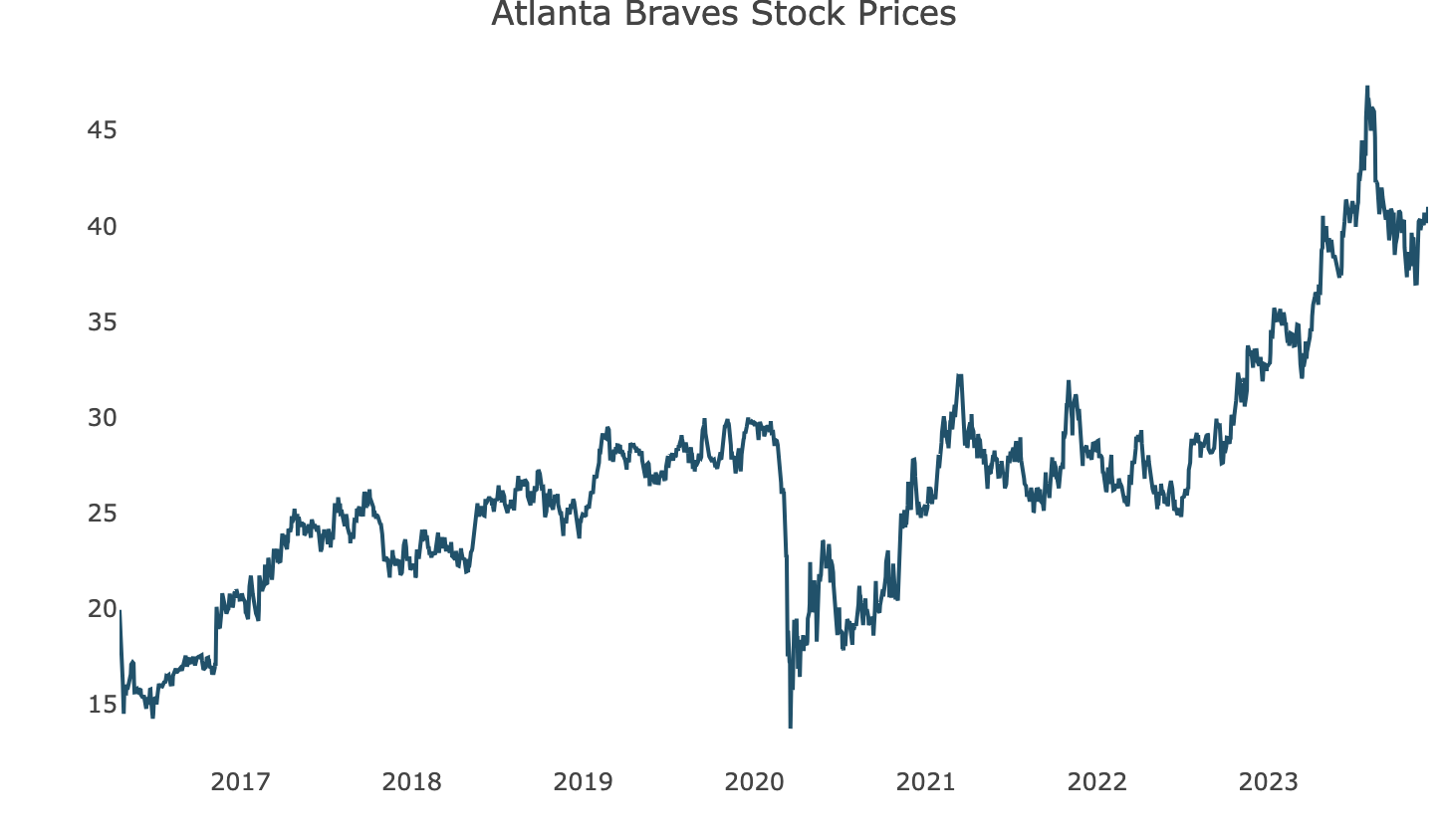
Apart from the huge dip near 2020, the graph looks more like it has a progressive, upward trend that is increasing over time with some small-level spikes and dips along the way. The BATRA class is an “xts” and “zoo” class.
Time-Series Chart of UKgas Dataset Using tsstudio01.R
library(TSstudio)
quantmod::getSymbols("BATRA", src="yahoo")
class(BATRA)
ts_plot(BATRA$BATRA.Adjusted,
        title = "Atlanta Braves Stock Prices",
        Ytitle = "")
class(BATRA) # What class is this object? It is an xts and zoo class.

# Some sample dataset from TSstudio
ts_seasonal(UKgas, type = "") # month-year matrix data

# What class is USgas? It is a ts class. I'm guessing ts equals time series?

# Sample charts
ts_heatmap(UKgas)
ts_cor(UKgas) # ACF and PACF
ts_lags(UKgas, margin = .02)
UKgas=data.frame(UKgas)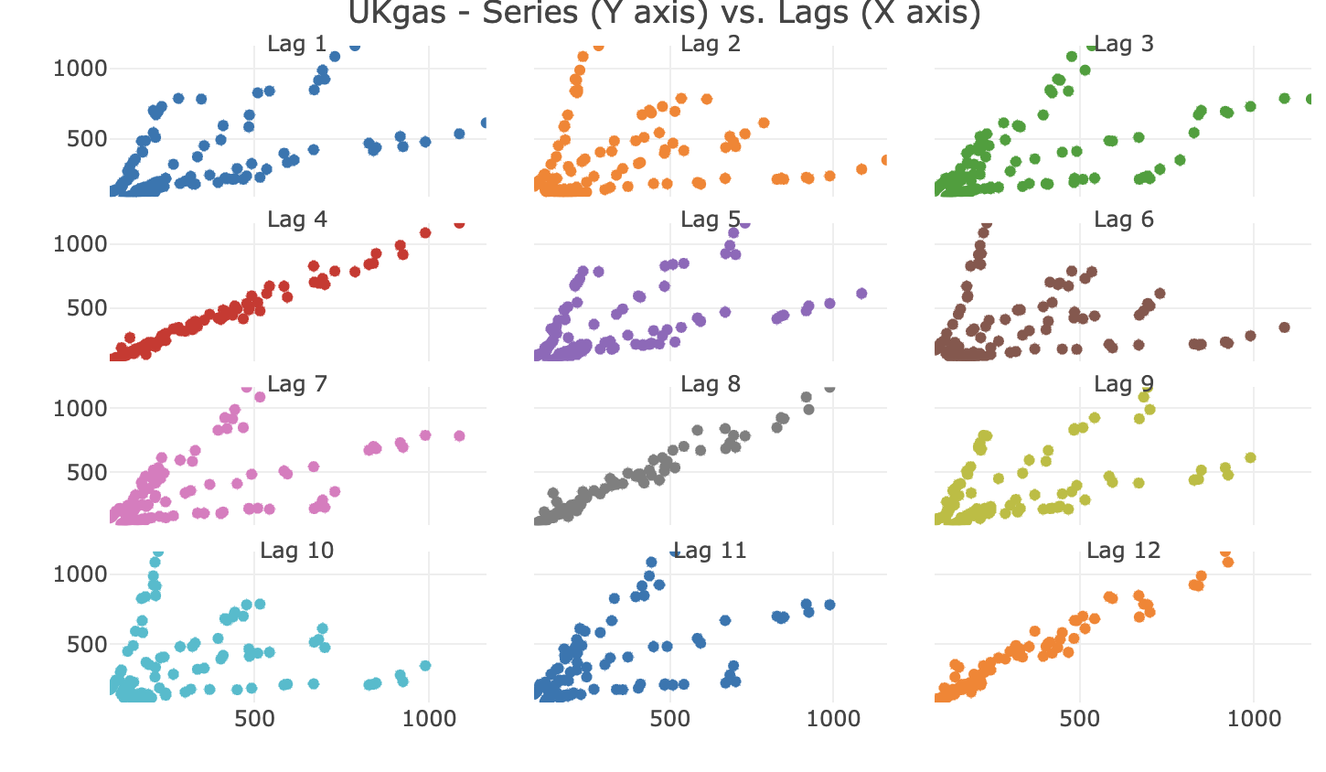
The data set “USgas” was replaced with “UKgas.” It shows faceting chart or grid commonly found in ggplot and the data set “USgas” and “UKgas” is of the class “ts.”