Graphs and Charts with R Graphics and ggplot2
Histogram with R Graphics
runs <- X2023BravesWinsAndLosses$R

bin_width <- 1

hist(x = runs, main = "Number of Runs Scored in Games by the Braves in 2023", xlab = "Number of Runs", ylab = "Number of Games", col = "red", border = "black", breaks = seq(min(runs), max(runs) + bin_width, by = bin_width))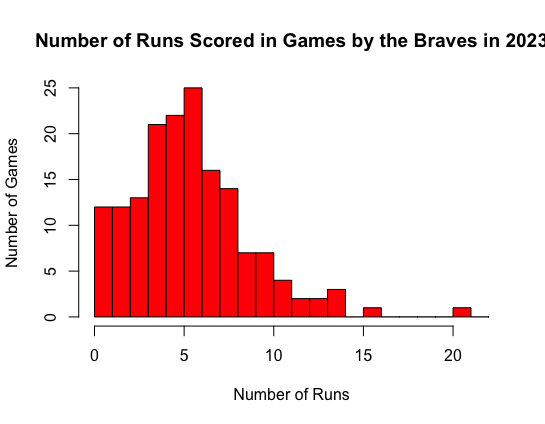
Bar Chart with R Graphics
months <- c("March", "April", "May", "June", "July", "August", "September",
           "October")
wins <- c(1, 17, 15, 21, 13, 21, 16, 0)
losses <- c(0, 9, 14, 4, 10, 8, 12, 1)
barplot(matrix(c(wins, losses), nrow = 2, byrow = TRUE), beside = TRUE,
        names.arg = months, main = "Atlanta Brave's 2023 Monthly Wins",
        xlab = "Months", ylab = "Count", ylim = c(0, 25),
        col = c("navy", "red"), legend.text = c("Wins", "Losses"),las = 2)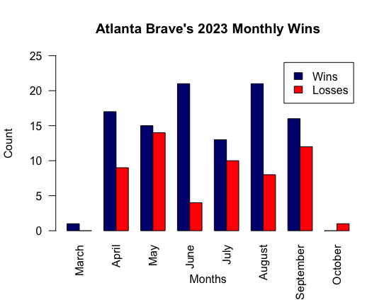
Pie Chart with R Graphics
data

home_runs2 <- head(data$HR, 8)

names <- c("Arizona Diamondbacks", "Atlanta Braves", "Baltimore Orioles", "Boston Red Sox", "Chicago Cubs", "Chicago White Sox", "Cincinnati Reds", "Cleveland Guardians")

colors <- rainbow(length(home_runs2))

pie(x = home_runs2, col = colors, labels = home_runs2)

title("2023 Home Run Totals by Team")

legend("topright", legend = names, fill = colors, title = "Teams", cex = 0.8)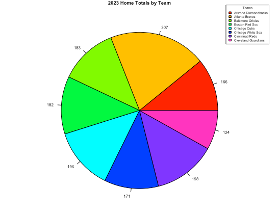
Histograms with ggplot2
# Import ggplot2
library(ggplot2)

# Use the ggplot function to create a histogram
ggplot(X2023BravesWinsAndLosses, aes(x = R)) + geom_histogram(binwidth = 1, fill = "red", color = "black") + labs(x = "Number of Runs", y = "Number of Games", title = "Number of Runs Scored in Games by the Braves in 2023") +
scale_y_continuous(breaks = seq(0, 25, by = 5)) +
scale_x_continuous(breaks = seq(0, 25, by = 5))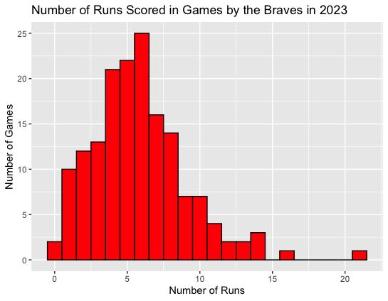
# Import ggplot2
library(ggplot2)

# Read and initialize data into an object
baseball <- read.csv("/Users/thefinas1/documents/2023BattingAverages.csv",
                     nrows = 8)

# Use the ggplot function to create a histogram
ggplot(baseball, aes(x = HR, fill = Tm, )) + geom_histogram(binwidth = 4) +
  xlab("Total Home Runs for 2023") + ylab("Number of Baseball Teams") +
  scale_y_continuous(breaks = c(0, 1, 2)) + labs(fill = "Baseball Teams") +
  scale_x_continuous(breaks = seq(100, 350, by = 50))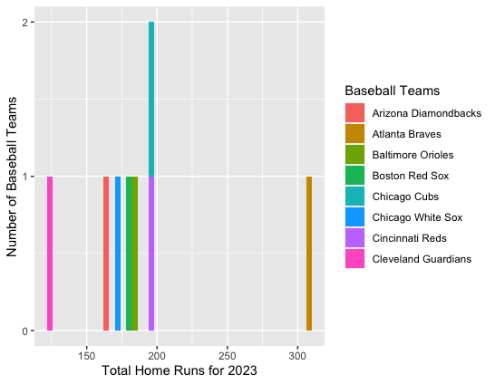
Bar Chart with ggplot2
# Create a data frame with the desired order of months
data <- data.frame(
  months = factor(c("March", "April", "May", "June", "July", "August", "September", "October"),
                  levels = c("March", "April", "May", "June", "July", "August", "September", "October")),
  losses = c(0, 9, 14, 4, 10, 8, 12, 1),
  wins = c(1, 17, 15, 21, 13, 21, 16, 0)
)

# Now, create a bar chart using ggplot2
library(ggplot2)

ggplot(data, aes(x = months)) +
  geom_bar(aes(y = wins, fill = "Wins"), stat = "identity", position = "dodge") +
  geom_bar(aes(y = losses, fill = "Losses"), stat = "identity", position = "dodge") +
  labs(title = "Comparison of Wins and Losses by Month",
       x = "Months",
       y = "Count") +
  scale_fill_manual(values = c("Wins" = "blue", "Losses" = "red")) +
  theme_minimal()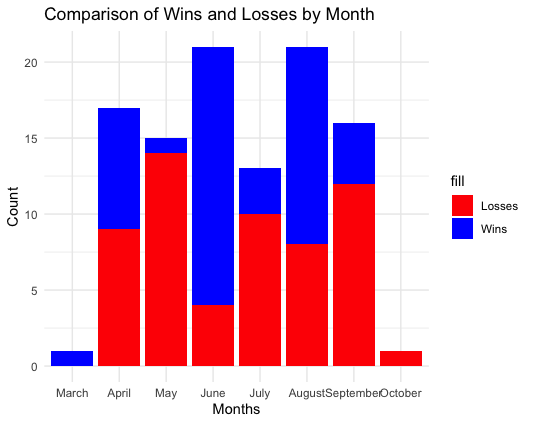
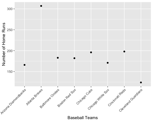
Scatter Plot with ggplot2
# Import ggplot2
library(ggplot2)

# Read and initialize data into an object
baseball <- read.csv("/Users/thefinas1/documents/2023BattingAverages.csv",
                     nrows = 8)

# Use the ggplot function to create a scatterplot
ggplot(baseball, aes(x = Tm, y = HR)) + geom_point() +
  xlab("Baseball Teams") + ylab("Number of Home Runs") +
  theme(axis.text.x = element_text(angle = 45, hjust = 1))