Shiny App Charts
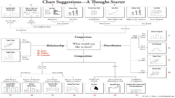
Examples of Chart #9 Scatter Chart and #18 Bubble Chart from “Chart Suggestions - A Thought Starter”
# Sample data
x <- X2023BattingAverages$BA
y <- X2023BattingAverages$PA

# Create a scatter chart
plot(x, y, main = "Batting Average vs. Plate Appearances of 2023 MLB Teams", xlab = "Batting Average", ylab = "Plate Appearances", ylim = c(5000, 7000), col = "blue", pch = 1
)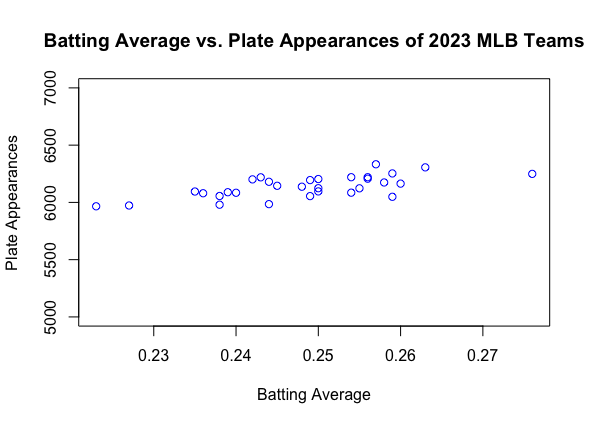
Example of Chart #9 Scatter Chart and Chart #18 Bubble Chart from “Chart Suggestions - A Thought Starter”
- From my Group Member, Tayaba Saleem: